Showing posts with label digital. Show all posts

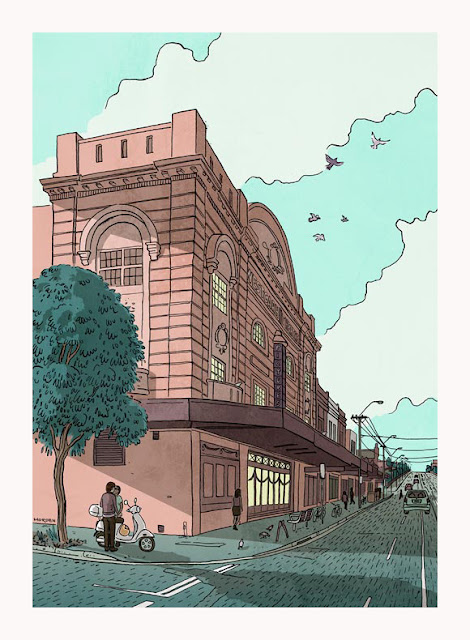
A poster illustration of the Westgarth Cinema

drawing of the westgarth cinema

I saw two people outside a cinema lean over a motor scooter to kiss and I knew had to make an artwork of it.

In this drawing, behind the kissing couple, is a building based on the Westgarth Cinema in Northcote, Melbourne. It used to be called the Valhalla, a fondly remembered arthouse cinema. I have watched hundreds of films in this place, but haven’t kissed anyone here while on a movie date… yet.

Visit my shop on Redbubble
to buy Meeting at the Cinema
on posters, art prints and other gift items

The artwork was hand drawn in pen and ink and coloured digitally. If you are familiar with the Westgarth Cinema you will probably notice I changed a few details. For instance you can't really park a motor scooter on that corner, and I removed a power pole because it looked visually odd and distracting imbedded in the awning as it actually is in real life.

I created the artwork as an entry to Illustrators Australia's art exhibition Paper to Pixel. So if you went to the exhibition this artwork will probably (hopefully) be familiar to you.

Pen and ink drawing of the Westgarth Cinema

Look at that big menacing ink blob right under the couple. Gaaagh!
Good thing there is digital editing.

To show some of the process here's the pencil rough and the ink drawing before I coloured it.


illustrating a map of historical railway lines

How many stations will need to be placed and labelled? 
255 stations on 27 lines. 
Hmmm, that's quite a few. Okay then, lets see how we go fitting all that information in...


Earlier this year I was commissioned to illustrate a historical map of Sydney's rail lines and stations. I was supplied with a rough layout and information of when the lines and stations opened, moved, extended, renamed or closed. A complex document to layout! I would like to think the result remains visually simple and easy to follow.

Truth is I enjoy putting together a historically based info-graphic like this and it makes me happy thinking of the historical train enthusiasts eagerly pouring over the carefully presented information.

If historical rail maps of Australia are your thing you can find this map and others available for purchase on Steve Watson's website www.trainsandtrams.com/sydney-train-map


a bench for my studio space

cheap standing height bench for my art studio

I made a bench for my studio space. The working surface is a lot higher than is typical for a work bench allowing me to comfortably draw at it when standing up.

I have to admit most of the work was done by the local hardware store. I asked them what I should do to make a cheap standing height bench to be used for light work, mostly drawing. They suggested the basic construction you see here and sold me a light hollow door, 3 metres of 70x35mm pine which they cut to the required lengths, some screws and drill bits. All that remained for me to do was drill pilot holes and screw the lot together. Even I could manage this.

And because I am much better at illustrating diagrams than I am at timber constructions here's a very basic isometric projection of how the bench went together.

isometric projection of my standing height work bench


illustration of a decorated cat skull

illustration of a decorated cat skull

Illustrators Australia and Redbubble
have collaborated with a gallery show of t-shirt art called Wear Art Thou.

As a member of Illustrators Australia I was invited to join in on the fun. The invitation came in May, but being distracted by work I only remembered the show when there was just 10 days left to think up a design, create the artwork and enter. Ahhh, pressure!

In a lunch break at work I scribbled a quick list of ideas then discarded most for being unsuitable for a t-shirt, or simply being too tacky. The idea remaining was to illustrate a skull.

The thought process went - Skulls are always popular on clothing, but skulls on t-shirts have been done to death (pun!) so it would need a point of difference. How about a cat skull? Cats are always popular on the inter-web, and I am super fond of them too. Might turn out a bit nasty looking, better soften it up with some sort of whimsy. Flowers would be ideal. Our last cat was called Wasabi, I could use flowers and leaves from a wasabi plant, making the image into a tribute for her. Awww, how sweet. So now the skull won't be scary, it will be poignant. Yep, lots of boxes ticked.

In a way it is actually two paintings: the first an airbrush style illustration of a cat skull, the second a naive painting of leaves and flowers appearing to wrap around the skull. The texture in the background is a photograph of the cement floor in my studio space.

This artwork was created to sell on line on a variety of products, so here comes the sales pitch...

Cat skull decorated with wasabi flowers is available to purchase on line via Redbubble 
on t-shirts, throw cushions, tote bags, posters, prints, stickers and gift cards.
Easy to order and delivered to your door


aardvarks and flying saucers

illustration of aardvark and UFOs

We have here yet another cover illustration for Ethel the Aardvark

Forward Aardvarkia is loosely based on an example of British wartime propaganda, but features a mysterious, suit wearing aardvark and a fleet of flying saucers.

It looks like an acrylic painting but is actually rendered with the mixer brush tool in Photoshop.
Just in case you are interested, this is the rough sketch. I scanned it and 'painted' over the top.

I like the juicy brush stroke detail the mixer brush tool can make, however it is not as intuitive or as fun as using a real paintbrush


fan-zine artwork

science fiction cover illustrationscience fiction cover illustration


Well that's the fanzine for my sci-fi club sorted for a couple of months.
Phew! *wipes sweat from brow*

This issue featured many wonderful contributions of images and articles by talented Melbourne Science Fiction Club members. Good content certainly makes for a good zine. Alas the contributors' artworks are not mine to show you here, however I can show you the few pieces I did for the issue - the cover illustration and a couple of author portraits.

As the current graphic editor/designer of Ethel the Aardvark, the bi monthly fan-zine of the MSFC, I regularly need to quickly create visual content to accompany articles. So I have been using the zine as a bit of an experimental playground to tinker with illustration styles and techniques.

The cover for this issue has a faux aged paper texture with corner creases incorporated into the artwork. The aged texture is a scan of an old book's plain back cover and the illustrated elements are derived from old artworks of mine. The theme of this issue was Space Opera. I wanted the cover illustration to evoke the look of a well used, dog-eared novel of space faring sci-fi drama.

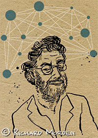
The portraits are of two well revered science fiction authors who recently passed away, Jack Vance and Iain M Banks, both of whom are the subject of tribute articles in this issue.

illustrated portrait of Jack Vanceillustrated portrait of Iain M Banks

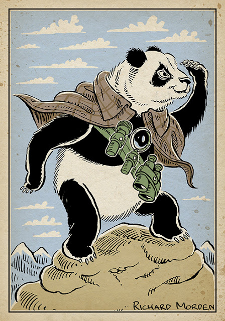
vigilant panda

vigilant panda illustration

Vigilant panda possesses incredible powers of vision and insight. It is ever alert and prepared for adventures and mighty deeds. An unusual commission from a few months ago.

He wears an Inverness cape, in homage to the super sleuth Sherlock Holmes. Prior to this commission I would not have known what an Inverness cape was. Oh the things you learn as an illustrator.


Space Neuron

Probably should be pronounced as
Spaaaaaaaace Neurrrrrrron
with an echoing dramatic kind of voice

It has been far too long since I've posted here. So here's a quick artwork to get back into the swing of things.

Space Neuron was intended as a quick editorial illustration to accompany an article written in memory of a sci-fi fan. I wanted it to have a bit of an enigmatic spacey vibe. Note the gratuitous lens flare - so cheesy, but I couldn't help it.

space neuron


Christmas cover collage

collage - Robot space santa battles the time bombs of destiny
Ethel the aardvark, the MSFC bimonthly fanzine, is now off to be printed.

For graphic content old images were collected based on the themes Christmas, time, and space... and koalas. These and all the scissors and glue I could get my hands on, were shared with a bunch of fellow sf fans. We spent the evening constructing collages.

Theirs were done with honest scissors and glue, mine were done digitally. 
Here is the zine cover art featuring a robotic father Christmas.

spuds and staffies

I know it is a bit cheesy doing faux stencil and splatter images, but digital art is usually the quicker and simpler way to do a freelance illustration gig. The customer wanted grungy street art styled images so I created vector images which look like hand painted stencil art.

These images are part of a range of graphics for a fish and chip shop.


book cover illustration for The Artemis Effect

A little while ago I was asked if I was interested in designing a cover for an ebook.

The book is The Artemis Effect by author Kasia James. It is a character driven story set in the near future, and follows the adventures of three people in different countries who must survive a world-wide collapse of communications, technology and society.

How could I say no?

cover art for an ebook The Artemis Effect by Kasia Kames


We all know a cover isn't just a pretty picture with some text - it is one of a book's most important promotional assets. So I read the book, then the author and I had a number of discussions. Based on these discussions I presented a selection of rough concept drafts before we settled on one, which was then worked into final art.

Our priorities were to
  • indicate something of the story's content, style and genre
  • create a design which communicates to the right audience
  • for the title and author's name to be very clear, even when previewed at tiny sizes

I could go on about all the careful cover design choices made, but actually I don't want people to see a bunch of design decisions, I simply want people to think "Yeah, characters I can identify with dealing with an end-of-the-world-as-we-know-it scenario... this book is for me!"

Do you think we succeeded?

You can buy The Artemis Effect here (Kindle edition)

You can find Kasia James' blog here

map of the supercontinent Pangaea


"Our world long ago, all the lands joined together
When first appeared beasties of fur and of feather"

This is a map of the world as it may have looked around 240 million years ago in the middle of the Triassic period. Drawn with pen and ink, coloured and textured digitally.

Two massive lands Gondwana and Laurasia had just bumped into each other, creating the Appelation Mountains and forming the supercontinent Pangaea.

Although there are other maps of Pangaea around, I could not find any illustrated in an old world style with monsters roaming the land and seas. So I just had to have a go at making one myself. Yep... nerd. I know.

Please note, I am an artist not a scientist. Although I did a fair bit of research to get it as right as I could, there is still plenty of artistic license. For instance, I made up all the rivers - sorry, I just couldn't find reference which told me where the real ones were. A few of the mountains could well be wrong too. And that volcano in between South America and Africa, well it just looked good there. So to any time travellers out there, this map is not to be used for navigation, it is decoration only!


Meet the beasties...

The animals featured are all carefully based on life that would have been kicking around within ten million years or so of that time. I intentionally didn't label them on the map, as I think leaving the creatures a little vague and generic aids imagination. Further more, when these creatures actually existed they didn't have titles such as Saurisichisan or Amonite, instead they would have thought of each other as 'the scaley thing with big teeth it is better not to go near' or 'the tasty little furred critter' or maybe 'the giant winged one who poos from the sky'.

But for the curious, and for a closer look at all the detail going on, here is a list of what the beasties are meant to represent. (You are allowed to scroll quickly through this bit. I am being a little self indulgent)


Cynodont illustration
Cynodont
Eoraptor

Nothosaur
Stagonolepis


Coelophysis
Placodont


Pterorynchus
Thalattosaur


Rutiodon
Panphagia


Cynognathian
Ichtheosaur


Eudimorphodon
Amonite


Eoraptor
Rauisuchus

Dicynodont
Helicoprion - alas I drew its mouth
swirl upside down. Whoops!


Temnospondyl


The Triassic plants featured are fern trees, ferns, conifers, giant club mosses, quillworts and cycads.

As you can see this artwork has an extraordinary amount of texture and detail. It is designed to look its best when printed at poster sizes. It would be ideal educational artwork for a classroom or decoration for a kids room.

R :)